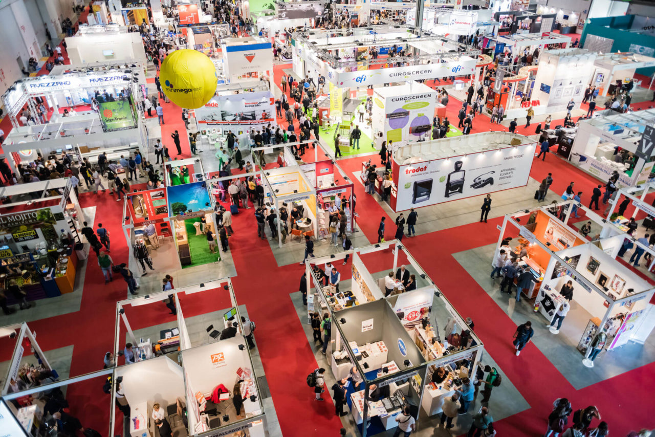
Designing your trade show booth graphics is about much more than just printing your logo on a banner. The right visuals can stop attendees in their tracks, deliver your message fast, and pull people into your space. From the height of your graphics to the color palette you choose, every design decision matters. It plays a role in how your space feels and how effective it is at attracting prospects. To help you make the most of your next event, here are seven key factors to consider when designing graphics. Here’s how to grab attention and drive traffic to your trade show booth.
1) Long Range Graphics
Design long-range trade show graphics to grab attention from 100 feet away or more. Use them to showcase your branding, logo, or signature products. When planning your booth, think about how far away attendees will be when they first notice you. Make sure your message is large and bold enough to pull them in.
2) Mid Range Graphics
Mid-range graphics reach attendees from 10 to 50 feet away. Use them to showcase your company name, products, or services. Place them where people can spot them as they walk the aisles. Their job is simple: pull traffic into your booth. Add a slogan, offer, or short phrase that sticks in the mind. Pair the text with bold visuals that make people stop. Position these graphics on the outer walls of an island or peninsula booth. You can also feature them across the back wall of your display to grab attention.
3) Short Range Graphics
Short-range graphics deliver your brand’s message once visitors step inside your booth. They work best at close range, from 1 to 10 feet. Use images and text that are clear only at short distances. Add detailed copy that highlights your products, services, or company story. Support the text with infographics, charts, or graphs that explain complex ideas quickly. These graphics should answer questions, build trust, and encourage deeper conversations with your team.
4) Height
- First, think about placement. Position long-range graphics at the very top of your booth. Use the maximum height allowed by show rules.
- Next, place mid-range graphics at or just above eye level, around 5 to 8 feet.
- Finally, keep short-range graphics right at eye level, between 5 and 6 feet. This layering ensures visitors see your message from far away, then mid-distance, and finally up close.
5) Color
Color can make your display stand out and determine the mood of your space. It’s best to have a professional designer help you with the choices you make based on your products and target market audience. Be careful to have a unified color theme. Most importantly, Colors have a powerful ability to effect emotion and mood. For example, Restaurants use reds, yellows and orange colors that have a stimulating effect, while hospitals use blue and greenish colors that have a calming effect.
5) Images
Imagery should be clear and easy to understand. Above all, the images you choose for your trade show graphics should support your message and be powerful enough to communicate it, regardless of whether an attendee reads your marketing copy or not.
5) Lighting
Although, lighting is not a graphic, it is very important to make yourself stand out. A well-lit trade show exhibit is essential, allowing visitors to easily read signs and promotional materials. Back lit panels are highly effective. You want lighting bright enough to draw attention without blinding attendees.


